
How Colorful, Charming Shopfronts can Energize Public Spaces
A couple of years ago I was traveling with a colleague to Seattle for a project. As we were walking to the hotel after dinner, we came across a beautiful storefront. It was two stories in height with high-quality detailing, red painted metal work around the windows and the perfect ratio of glass to casing. It was so eye-catching that my colleague described it as a jewel box.
As a designer, I have always wondered how to design a frontage so affectionately described as a jewel box. Remember when we talked about architectural proportions? When associated with the orders, building proportions are much like a language. There are rules, and the moldings and details make up the whole composition of the building.
My research surfaced five principles for good shopfront design:
The design should respect the composition of the building and character of the street;
Signs should be restrained, uncluttered and repeat the character and design of the building;
Illumination should be subdued and appropriate to the building and neighborhood;
Corporate identity should be tailored to suit the context of the building and street; and,
Materials, lettering and color should be sensitively chosen to be appropriate to the building and neighborhood.


In essence, be considerate of the building's proportions, local character and neighboring buildings. Are we starting to see a theme emerging? I think the building architecture can show a little kindness, but the shopfront is where we can let our hair down a little and become surprise architects.
The first place we can bring joy to a shopfront is through our use of color. If we think back to the earlier example, red is associated with energy and power, and should be used as an accent color. Our eyes are drawn to the color red first, therefore a little can go a long way. Orange is a joyful and inviting color. It calls upon feelings of happiness, friendliness, and gratifying connection. Did Roman architects know this? Orange is a great color to use in gathering spaces and outdoor seating to promote social interaction and relationship building. Yellow is the color of brightness, optimism and mental clarity. Green is a strikingly pleasing color, invoking renewal, balance, refreshment and peace. In addition to integrating green into the building color itself, it can be used through street trees, planter boxes and rain gardens. Blue promotes rest and calm and is a very popular color. Violet stimulates the problem solving areas in our brain, and it promotes creativity, intuition and artistic ability. That must mean that when we pass by a flower market we are in joy overload with all of these positive emotions!


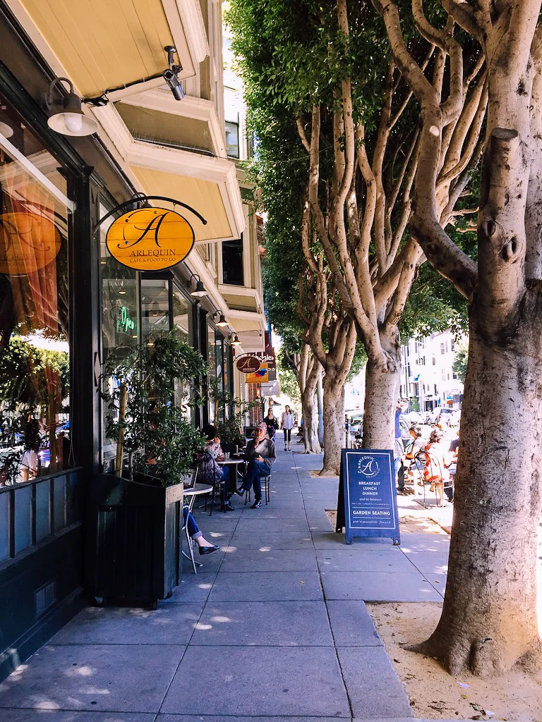
There are other components integrated into shopfronts that create an experience, this can be seen along Fillmore Street in San Francisco. Transparent glazing enables us to see into the stores and observe merchandise as well as unique interiors. Lighting from within and outside the store illuminates the sidewalk working in conjunction with human scale street lights. There are specials written in chalk on store front windows and on sidewalk signs. Water bowls for puppies sit at the entrance along with benches to linger.
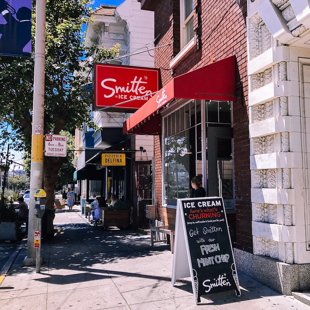
Through The Architecture of Happiness, we know that buildings and objects engage our personalities and evoke memories. In Stumbling on Happiness, we learn that the brain remembers unhappy memories more vividly than happy ones. As designers, is it our responsibility to advocate for a public realm that triggers joyful memories? I think we all need a little help to outsmart our whirring minds. I had this thought as I was walking in front of Smitten Ice Cream where I could smell the fresh waffle cones and see the churning ice cream. Of course, I had to stop for a creamy scoop with rainbow sprinkles!


I created this arrangement of analysis drawings to reflect the five principles of good shopfront design. The sources for the drawings are Iron Architecture of New York, NY and Fillmore Street in San Francisco, CA. Let me know what you think!

